Dezeen School Shows: an exhibition showcasing chairs made from cardboard is included in Dezeen’s latest school show by students at the University of Kansas.
Also included is a packaging design for shoelaces and a magazine featuring typographic exploration.
Institution: University of Kansas
School: School of Architecture and Design
School statement:
“The University of Kansas’ Design Department is at the heart of the KU campus. The University of Kansas is located in Lawrence, Kansas, a small college town 40 miles west of Kansas City. The design department is housed in the KU School of Architecture and Design.
“The Department of Design prepares animators, illustrators, experience designers, graphic designers, marketing creatives, motion designers, photographers, product designers, UX/UI developers and other multidisciplinary communicators to thrive as innovative practitioners and socially engaged leaders in an ever-changing professional field.
“The design department offers four-year, 120-credit-hour BFA degrees in design with programs in animation, illustration, industrial design, interaction design and visual communication design. All design students spend the first semester in foundation courses and in the second semester begin taking courses in their chosen major.
“The department offers minors in design, photography, design entrepreneurship and certificates in book arts.
“The department also offers two graduate programs in design, MA in interaction and user experience design and MA in management and strategy.
“Design students have access to studio spaces, computer labs, a letterpress lab, a RISO lab, a robust photography area and digital fabrication labs. Students gain insights from lectures and workshops with world-renowned designers, collaborations with industry partners, and opportunities to participate in study abroad programs (short-term: Italy, London, Paris, Miami and Havana, semester-long: Germany and Spain) and internships in the USA and abroad.
“Design students are encouraged to participate in student organisations (Black Creatives Collective, NOMAS and AIGA). Students lead the planning, design and production of the annual KU design week and the semi-annual publication, KIOSK Magazine. Students have the opportunity to display their work in Chalmers Hall’s Edgar Heap of Birds Family Gallery and in numerous gallery spaces throughout the campus.
The University of Kansas has been an accredited institutional member of the National Association of Schools of Art and Design (NASAD) since 1968.
“Recently the KU School of Architecture and Design has been engaged with the Bjarke Ingels Group (BIG) to develop a new future for its campus presence.”
Peach typeface by Tim Do
“Peach is a bold sans serif typeface featuring geometric ink traps and playful rounded corners.
“Made in Glyphs, this type was inspired by old farmer’s market signage and the sweet memories of summer vacations.
“The primary goal of this studio is to give students an introduction to the world of type design – we practice designing type systematically, focusing on looking at, defining and refining the interrelationships between forms.”
Student: Tim Do
Course: VISC 450 Typographic Universe
Tutor: Andrea Herstowski
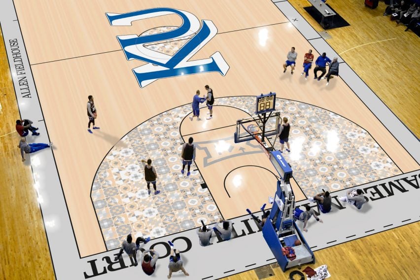
Redesign of Allen Fieldhouse basketball court graphics by Bjarne Reinmann
“The project brief asked students to examine the storied history of basketball at KU and redesign the basketball court graphics in KU’s Allan Fieldhouse.
“KU basketball history includes James Naismith, the inventor of basketball and founder of the Kansas basketball program for whom the court is officially named after.
“For his project, Bjarne looked at a slightly different history – he was inspired by the aerial view of the wheat fields of Kansas and the historic quilted blanket designs from the early midwestern pioneers.
“This course examines core principles and practices of environmental graphic design, many of which are concerned with the visual aspects of way-finding, communicating identity and information, shaping the idea of place.”
Student: Bjarne Reinmann
Course: VISC 425 Environmental Graphics
Tutor: Tim Hossler
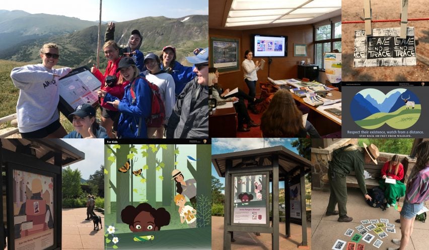
Design Outside Studio by Nicole Strubing, Ella Gore and Carson Keeling
“Design Outside Studio is a teaching and research project led by Jeremy Shellhorn in collaboration with Rocky Mountain National Park.
“Our studio loves to be outdoors, out of the classroom and into parks and places that challenge us to design, think and make in new ways.
“We realise the design process is a powerful tool for making things better, visualising ‘what if’ and creating change.
“As our parks and public spaces face challenges connecting visitors to meaningful and sustainable learning and recreational experiences; we as a studio (students and faculty) look to find ways in which to collaborate with organisations, parks, rangers and fellow outdoors-folk to communicate engaging and effective conservation messages.”
Students: Nicole Strubing, Ella Gore and Carson Keeling
Course: ADS 560 Design Outside
Tutor: Jeremy Shellhorn
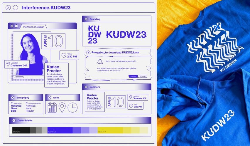
KU Design Week branding & development by Christian Toth, Issac De La Rosa, Annie Myers and Emma Tuel by Christian Toth, Issac De La Rosa, Annie Myers and Emma Tuel
“KU Design Week (KUDW) aims to promote interdisciplinary design thinking to KU students and beyond through lectures, activities and events.
“Design Week is coordinated entirely by KU Design students and is held annually.
“The branding for KUDW 23 combined vintage glitchy computer graphics and analogue production to create an award-winning iconic identity.”
Students: Christian Toth, Issac De La Rosa, Annie Myers and Emma Tuel by Christian Toth, Issac De La Rosa, Annie Myers and Emma Tuel
Course: KU Design Week (KUDW)
Tutor: Sam Meier
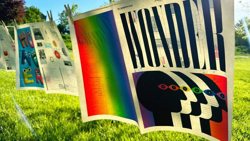
Wonder Magazine by Abby Miles
“Students were asked to conceptualise, design and produce a magazine – the definition of what a ‘magazine’ is was left open to interpretation, and students created all of their own content.
“Special attention was given to thinking of the magazine as a physical object; Abby Miles’ magazine expressed her love of typography, colour and illustration.
“Her magazine became a cabinet of curiosities to make the reader inspired and a little bit confused.
“This studio course explores the topics of editorial concepts, format organisation, production and publication.”
Student: Abby Miles
Course: VISC 414 Publication and Editorial Design
Tutor: Tim Hossler
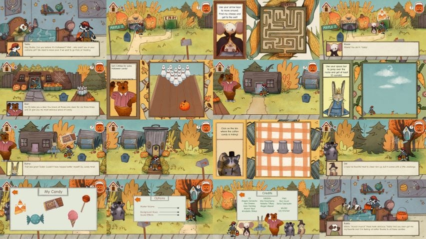
Halloween on Maple Street Video Game Development by Mia Haverkamp, Megan Weaver, Natasha Tiffany and Teddy the Dog (Design); Magaly Camacho, Ava Greene, Josie Harding, Manvir Kaur, Annabelle Stokes (CS), Ben Gould, Deniz Tozaraydin (FMS) and Lily Gruman (Music)
“Halloween on Maple Street is a charming game that teaches young children animal facts as they play through a series of Halloween-themed mini-games.
“Brothers Teddy and Buddy are all ready for some trick-or-treating fun, but it looks like Buddy has come down with something – help Teddy visit each of his animal neighbours and play games to earn Halloween treats to bring back to his sick brother. And pay attention – if Teddy can remember the animal facts mentioned by each of his neighbours, then Mr Owl has promised Buddy’s favourite candy of all.
“This course is an interdisciplinary design class that connects students in the Illustration Program with computer science students from the School of Engineering, film majors from the Film and Media Studies Department and composition and production students from the School of Music.”
Students: Mia Haverkamp, Megan Weaver, Natasha Tiffany and Teddy the Dog (Design); Magaly Camacho, Ava Greene, Josie Harding, Manvir Kaur, Annabelle Stokes (CS), Ben Gould, Deniz Tozaraydin (FMS) and Lily Gruman (Music)
Courses: ADS 560: Visual Development for Video Games working with EECS 690: Special Topics: Interdisciplinary Collaboration (Engineering), FMS 303: Undergraduate Production Seminar (film), MTHC 480: Electro Acoustic Composition II (Music)
Tutor: Matthew Cook with Dr John Gibbons, Dr Joshua Miner and Dr Gulli Bjornsson

Sweet Sugar Express Toy Train by Lauren Calarco
I’ll be focusing a lot of my toy designs on inclusion and education-based toys – I find there is a large gap in the toy company when it comes to inclusive toys when it comes to things like ethnicity, gender and body type.
“With my mom being a teacher, I found myself interested in promoting learning through toys and finding new ways to help kids further their skills whether that be in a niche interest or an overall helpful ability.
“The focus of this course is to give students extended time to make a cohesive body of professional quality work for a portfolio that will prepare them to enter their chosen field of illustration or animation.”
Student: Lauren Calarco
Course: ILLU 545 Promotion and Marketing for Illustration II
Tutor: Barry Fitzgerald
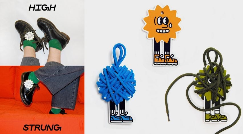
High Strung shoelace packaging by Anna Matuella
“A packaging design solution for shoelaces from a dollar store – designed with sustainability in mind, the packaging uses the shoelace as a part of its structure, while furthering the overall concept.
“Unwrapping the lace reveals the brand’s different nervous personalities and creates an involved and engaging user experience.
“A brand’s visual identity expresses an organisation’s big idea of what it is, how it lives in the world, who is serves and why – it needs to engage and communicate to specific audiences while differentiating the brand from its competition.
“This class explores the creation of brand identity elements such as logos, icons and symbols, as well as how these can be organised into a ‘system of parts’ that can communicate across multiple applications.”
Student: Anna Matuella
Course: VISC 405 Designing Brand Identity
Tutor: Alex Anderson
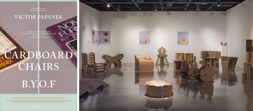
Cardboard Chairs by First Year Design Students
In honour of the centennial birthday of former KU Design professor Victor Papanek, all first year KU Design students used Papanek’s Nomadic Furniture books as their cardboard chair project launching point.
“Students worked collaboratively to design a solution for sitting out of corrugated cardboard that could hold the weight of at least one person.
This project focused on 3D design and the relationships between material, function and form – building cardboard chairs in collaborative teams of three, students explored the mechanics and physics of material, the shaping and directing of functionality and the inherent aesthetics that exist in between.
“The project pushed the evolution of ideas through prototyping and design process that engaged research, drawing, designing, testing material, making mock-ups and refinement of 3D solutions, and a selection of the final chairs were displayed in an exhibition at Chalmers Hall’s Edgar Heap of Birds Family Gallery.
“BDS 101 is an introduction to creative problem-solving and the fundamentals of 2D, 3D and 4D design. Drawing, photography and physical models are used in this course as a means of design thinking to visually represent problems and solutions. All first year KU students take this course their first semester.”
Student: First Year Design Students
Course: BDS 101 Design Thinking and Making
Tutor: Kent Smith, Lilly McElroy, Titus Smith and Matthew Lord
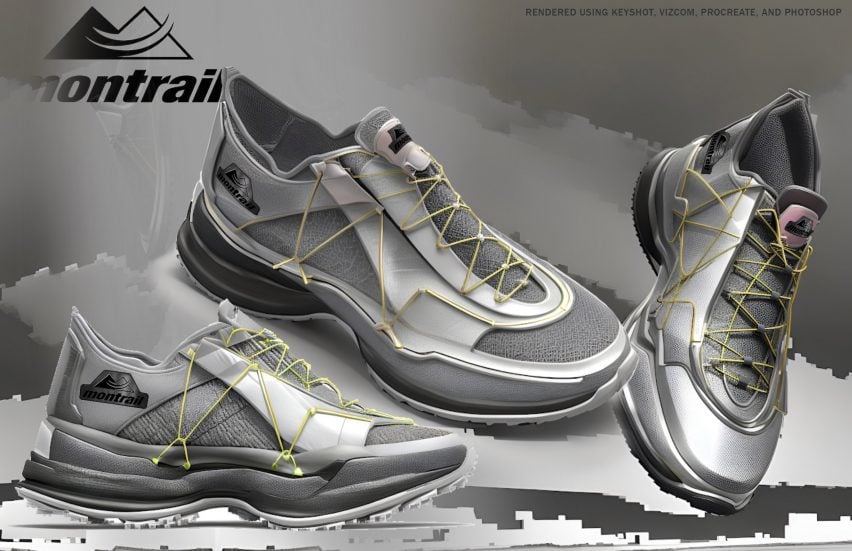
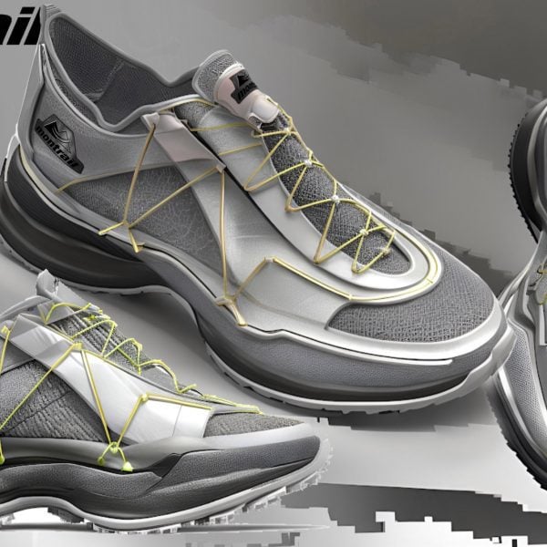
Rescue Runner footwear design for Montrail by Cydney Putnam
“This project showcases a footwear sponsored studio with Columbia, designing for their brand Montrail.
“Tasked with designing a pair of running shoes for the ‘rescue runner’, the three-week project consisted of performing market research, understanding stack height considerations, which is the amount of shoe material between your foot and the ground and designing an aesthetic focused on textures and colour ways pulled from the environment of a late night escape.
“The workflow included sketching, Gravity Sketch, a 3D platform used in VR, Keyshot, Vizcom and Photoshop. We presented this concept to the design team at Columbia.
Shoe designers use their knowledge of fashion trends, materials, user profiles and experiences to create shoes for new footwear lines.
“The studio is an introduction to shoe design methods and techniques, providing opportunities to research industry trends, explore design concepts, patterns, materials, practice sketching designs by hand, finalise concepts and develop the presentation of finished ideas.”
Student: Cydney Putnam
Course: INDD 380 Footwear Design Lab
Tutor: Lance Rake
Partnership content
This school show is a partnership between Dezeen and the University of Kansas. Find out more about Dezeen partnership content here.

