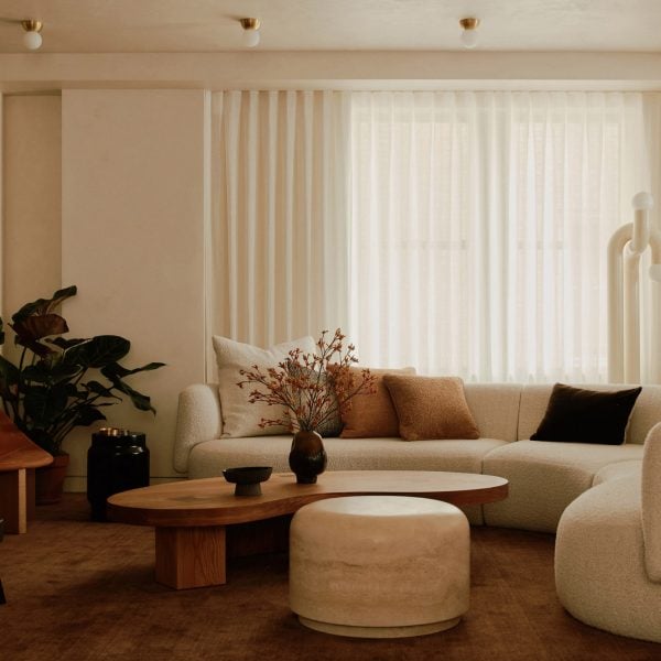
Design studio General Assembly has used a wide material palette to transform an apartment on New York City’s Upper West Side, decorating it with marble and travertine stone and adding wood for a lighter feel.
The studio completely transformed the layout of the 3,050-square-foot (284 square metres) flat, which was designed for a young family.
“The floorplan has been completely reimagined,” General Assembly co-founder Sarah Zames told Dezeen.
We moved all the walls and most of the plumbing in order to better accommodate the needs and lifestyle of the clients – we felt it was important to organize the spaces based on the way they used the space.
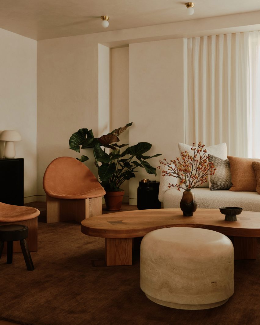
One side of the flat was designed to be quieter and family-focused and houses the bedrooms and family room, while social areas can be found at the centre of the apartment.
Guest spaces are contained in a third area, which was designed using warmer materials and has a more intimate scale.
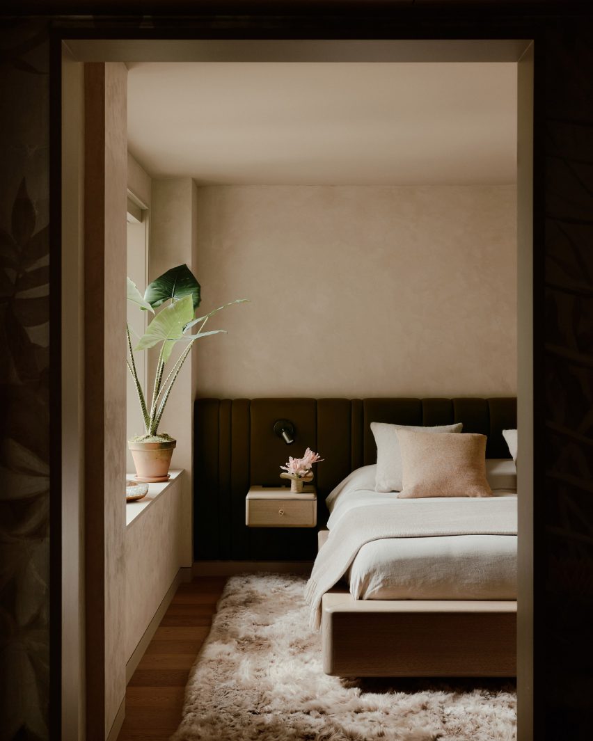
Located in an early 20th-century stone building by Italian-American architect Gaetano Ajello, the studio drew on the surrounding architecture when designing the apartment interior.
“We were inspired by the grandness of the New York pre-war building,” Zames said.
“We loved its deep columns and beams and wanted to work in a way that honored these kinds of details while balancing them with softer textures and quieter moments.”
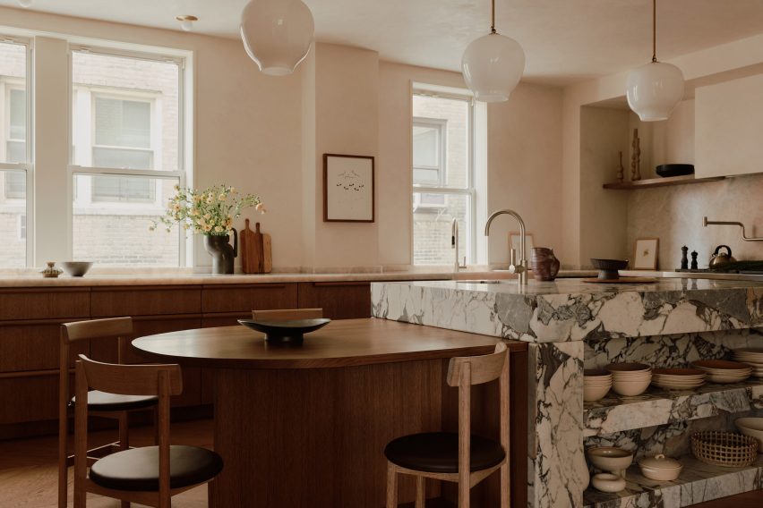
General Assembly worked with many different materials for the apartment, whose walls are clad in Venetian plaster in a nod to the fact that it’s the material that would have been used for the original walls.
“We chose to finish many of the spaces with Venetian plaster because it created a subtle shadow and depth on the walls and ceilings,” Zames explained.
“We liked the way it reflected the natural and decorative lighting without overwhelming the space – the movement and texture of the wall is so minimal, that on first glance you may not realize that it is even plaster,” she added.
“But, as you watch the day progress, the light shifting becomes more apparent.”
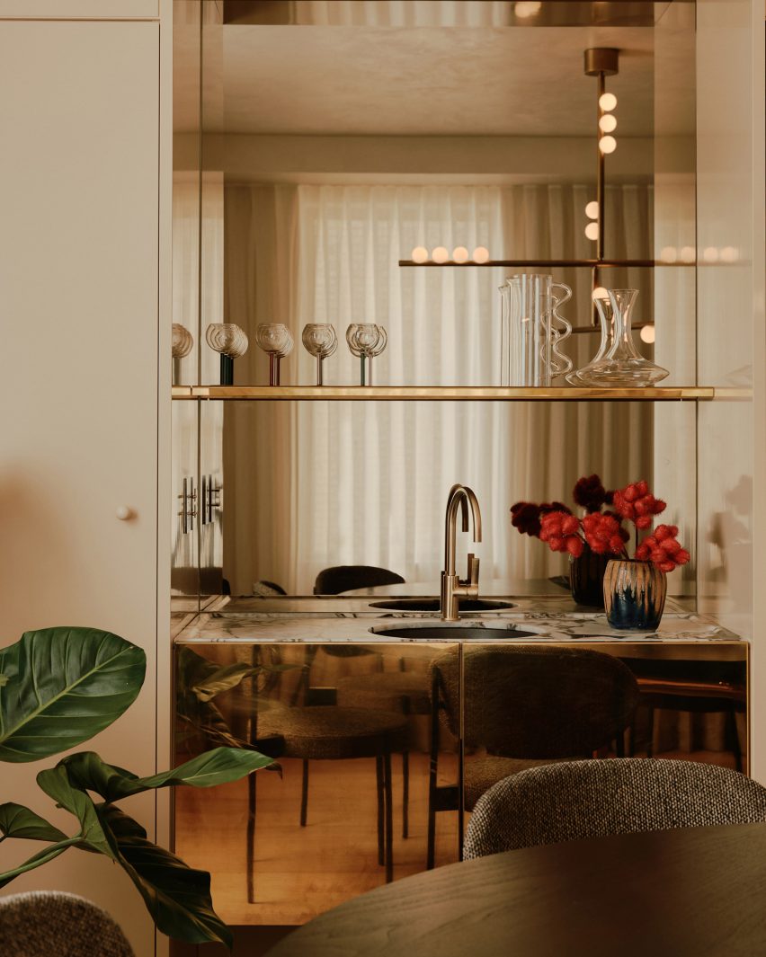
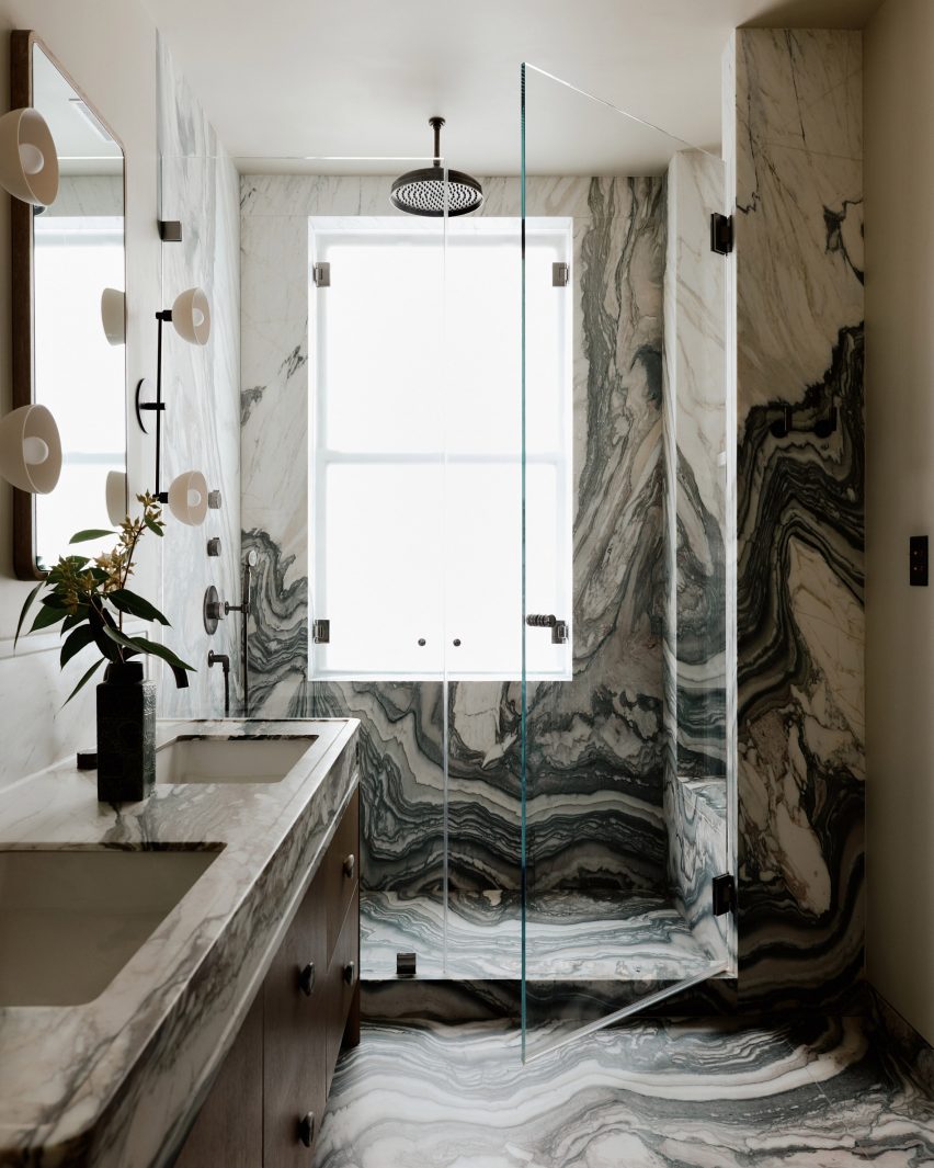
The studio decorated the kitchen and bathrooms with dramatic marble surfaces and also placed a side table in solid travertine in the living room.
“We felt that stone, a material that lends itself to the nature of the pre-war building, was such a natural choice for this project,” Zames said.
“We wanted to emphasize its weight, designing voluminous pieces and detailing to emphasize these qualities.”
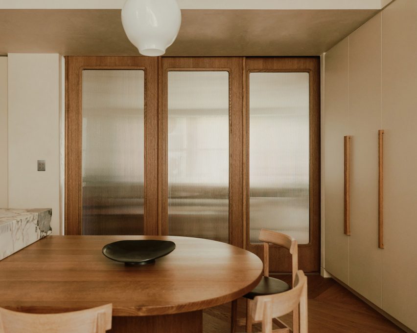
To contrast the stone, wood was used for much of the furniture and for the sliding doors leading into the kitchen.
“The wood was just as important in the design because it provided a counterpoint to the heaviness of the stone and the architecture of the building,” Zames said.
“Not only was the wood lighter in color, but the details in the wood finishes feel lighter to the touch and slightly more delicate.”
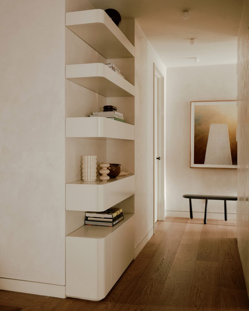
Throughout the flat, built-in shelves and cabinets maximise storage and reference the original design of the flat.
To create the right ambience within the apartment, General Assembly used earthy colours for the interior.
“We drew predominantly on earthy hues complimented by jewel-toned accents,” Zames said.
“We wanted to go with a comforting and quiet palette that evoked feelings of permanence. We always use natural and living materials in our projects, wherever possible – so many of these finishes will patina over time and add further to the depth of the design.”
Pieces by independent designers were also used for the space to give it more character and personality.
“The clients were really open to bringing in more independent designers, many of whom we also carry at our shop, Assembly Line,” Zames said.
“That gave us the ability to do a lot of customization and freedom in how we designed and outfitted the space.”
General Assembly has previously updated an apartment inside a brutalist Manhattan tower and decorated a Bergen Street apartment with brass.
The photography is by William Jess Laird.
Project credits:
General contractor: ALL Construction
Structural engineer: Jim Moore and Associates
A/V and lighting: Fiks Consultants for AV and Lighting Infrastructure
Upholstery & window treatments: Fernando Guaman for Custom Upholstery and Window treatments

