Dezeen School Shows: an app designed for smartphone use which aims to assist people with ADHD is included in Dezeen’s latest school show by students at Florence Institute of Design International.
Also included are rebrands of a food delivery service and a museum of Egyptian culture.
Institution: Florence Institute of Design International (FIDI)
Course: Design Research Project – BA (Hons) Design
Tutor: Eleanor Ferguson, with final review jury of Kate Eadie, Federica Fabri, Dusko Stojanovic, Marc DiDomenico and Saber Naeemi
School statement:
“FIDI is an international design school located in the centre of Florence, Italy. The Design Research Project studio courses are held during the final year of the three-year Graphic Design programme.
“The third Year Graphic Design Research Project is a self-driven body of work generated over a period of 30 weeks, culminating in a final presentation where students are given the opportunity to demonstrate the extent of their understanding and ability in applying design theory in practice.
“Students are required to form a working hypothesis, around which they must focus on delivering a unique graphic design solution to a real-world problem they have uncovered.
“Each project has its unique challenges and particular design angle requiring substantial primary and literary research on the topic.
The three-year programme offers intensive curriculum teaching on various aspects of graphic design to acquire advanced skills and knowledge and develop professional relationships with practitioners within the international design community.
“The course results in a validated bachelor degree, BA (Hons) Design, issued in collaboration with the University of Chester.”
Guiarte by Natalia Macarena
“Guiarte is a tour guide company which provides personalised itineraries and experiences for visitors to Mexico City.
“Built on extensive research into the capital’s tourism structure, Guiarte targets specific issue areas such as transportation, lack of visitors to museums and the obstruction from preconceptions about the city.
“Custom design elements distinguish Guiarte in the industry, including its colour palette which was curated based on the typical plant species local to Mexico.
“The branding spans from t-shirts, cards and billboards to identifiable tour buses found around the city.
“Hoping to provide lifelong memories for each visitor, Guiarte is dedicated to showing Mexico City in its best light.”
Student: Natalia Macarena
Course: Design Research Project
Tutor: Eleanor Ferguson
Email: nataliamc1[at]outlook.com
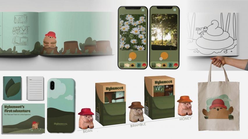
Hykemoot by Alexa Patmor
“Hykemoot, an educational children’s app, is aimed at combating the increased reliance on technology in children today.
“The app’s goal is to have kids motivated to go outside and experience navigating nature.
“Acknowledging that technology could aid in this goal without becoming excessively stimulating, Patmor developed an app concept where the user progresses to higher levels by completing outdoor tasks.
“The design choices were made with the intention of enhancing a child’s user experience while easing them into familiarity with the colours of nature, specifically avoids colours and app elements which can lead to excessive screen use.
“Through this project Patmor challenges the standards in educational apps today, hoping to help the younger generations thrive in the natural world.”
Student: Alexa Patmor
Course: Design Research Project
Tutor: Eleanor Ferguson
Email: alexa.patmor[at]gmail.com
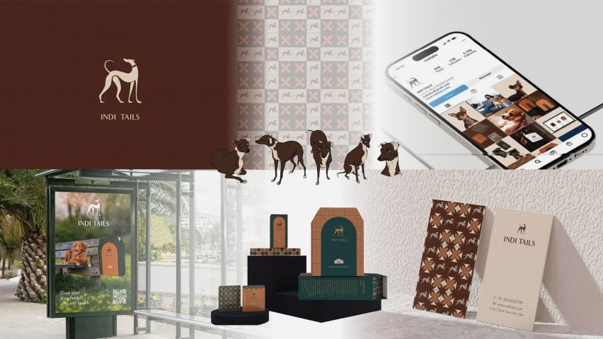
Indi Tails by Amrita Das
“Indi Trails explores if changing the visual language within a cultural framework can positively influence human behaviour towards animal welfare.
“The project is centred around dog breeds most common to India, and deconstructing the perception that they are only street dogs or unfashionable pets.
“Das’ blend of graphic design, illustrations, packaging, coffee table book and digital media celebrate the unique qualities of Indian breeds.
“The colour palette and primary logo draw from the colours typical of India-bred dogs, and through allegorical elements like a collar and a window, the logo creates new associations of luxury and care for these dog breeds.
“Indi Trails hopes to raise awareness through luxurious and progressive branding, setting the tone for greater inclusion in animal welfare.”
Student: Amrita Das
Course: Design Research Project
Tutor: Eleanor Ferguson
Email: amritadas2917[at]gmail.com
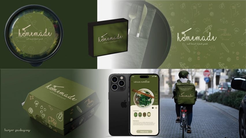
Homemade by Kenzy Elwakil
Built to connect people through health and community, Homemade is a local food delivery company servicing the northern Dutch town Enschede.
“Elwakil’s rebrand stems from the company’s desire to build trust with their consumer by creating a brand identity that closer aligns with ‘homemade’ values.
“To do this she utilised a type and colour pallet that pulled from the foundation of their product – the organic ingredients used in their cooking.
The result is a logo and interface that reflects a healthy and energetic lifestyle, as well as a rebrand of packaging, staff delivery uniforms and accessories, an app and in-store tableware.
“The new aesthetic establishes a strong brand identity for Homemade, one that stays true to their core value of serving the community with quality, health-conscious meals.”
Student: Kenzy Elwakil
Course: Design Research Project
Tutor: Eleanor Ferguson
Email: kenzyelwakil[at]gmail.com
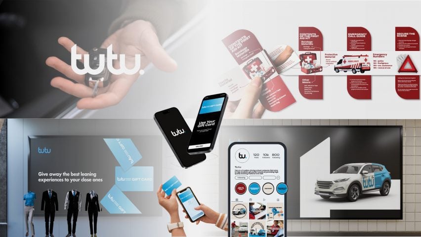
Tutu by Margareta Fabic
“Tutu is an immersive driving course, comprised of 30 hours of classes and 35 hours of driving and three exams.
“The course includes both interactive web material and a game-based learning platform to engage its users.
“The brand’s name and logo, Tutu, is derived from repeating the Croatian word ‘tu’: meaning here. By doubling this word, Fabic creates an onomatopoeic effect that mimics the sound of a car honking when spoken and the visual of a winding road when written.
“The colour palette is bold and decisive, helping to highlight the important information within the product materials and encourage memorisation.
“With branding including an Instagram page, website, billboard ads, uniforms and car designs, Tutu targets an underserved market, paving the way for new drivers while ensuring our roads stay safe.”
Student: Margareta Fabic
Course: Design Research Project
Tutor: Eleanor Ferguson
Email: margaretafabic5[at]gmail.com
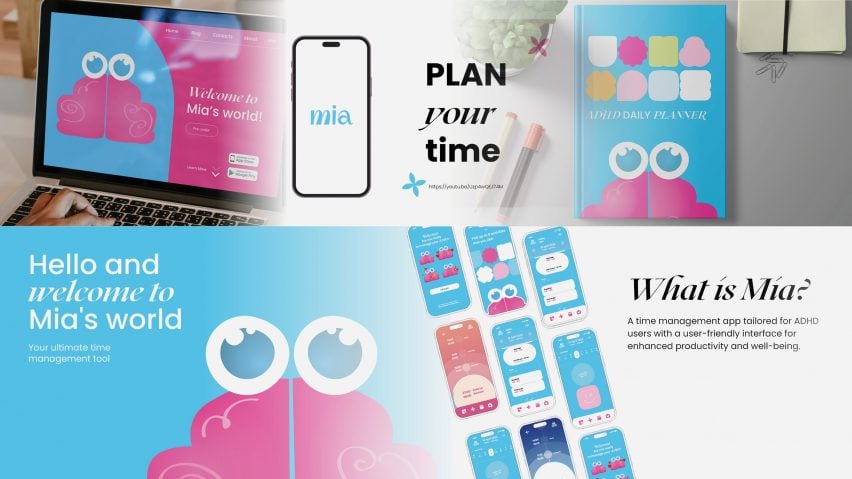
Mia’s World by Karina Pecheniuk
“Mia’s World is an app created to specifically empower individuals with Attention Deficit Hyperactivity Disorder (ADHD).
“The platform is tailored to diverse cognitive styles, promoting time management, organisation and wellbeing for its users.
“The logo was created specifically for easy readability and instant visual attraction by utilising primary colours and inclusive shapes.
“Pechenuik’s primary colour palette choice draws inspiration from the colours of the sky throughout the day, creating an authentic and realistic daytime experience.
“In addition to the app interface pages, Mia includes a hard copy ADHD daily planner for those who prefer a physical management system.”
Student: Karina Pecheniuk
Course: Design Research Project
Tutor: Eleanor Ferguson
Email: kpechenyuk6[at]gmail.com
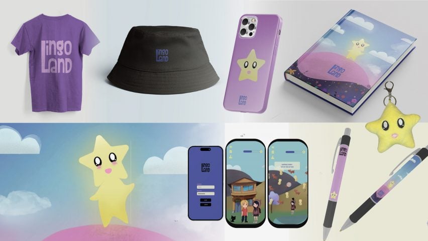
Lingo Land by Nina Pandilovski
“Lingo Land is an immersive language app, distinguished by its focus on memorisation, incorporation of interactive elements and personalised features.
“Targeting Gen Z, Pandilovski created a user-friendly game complete with various characters designed in the Japanese Chibi style, which typically features larger heads and eyes, emphasising facial expressions.
“These facial expression plays a key role in the user experience and memorisation, showing the intent or reaction behind words and phrases.
“Through her colour choices and lighter palet, Pandilovski stimulates imagination while maintaining a balance with simplicity in the interface.
“Lingo land also includes a complimentary language learning journal, pen, keychain, hat, t-shirt and plush toy.”
Student: Nina Pandilovski
Course: Design Research Project
Tutor: Eleanor Ferguson
Email: ninapandilovski[at]gmail.com
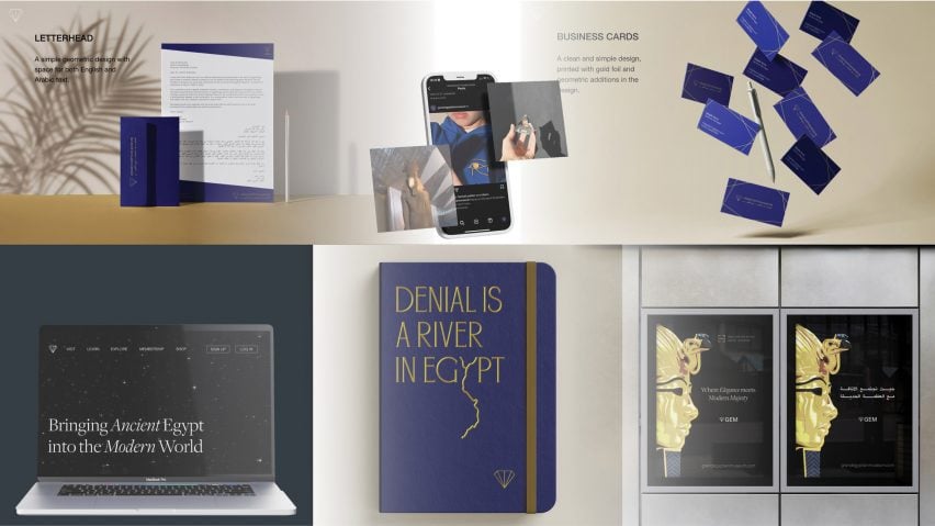
Design Research Project by Magda Azmy
“Through her rebranding of The Grand Egyptian Museum (GEM), Azmy explores how graphic design can bridge the gap between modern and ancient Egypt.
“The project embraces Egypt’s culture from a Middle-Eastern voice rather than that of a Western perspective.
Highlighting aspects of Ancient Egyptian makeup, writing and architecture, GEM’s new logo and brand message echo the essence of the project’s purpose and its historical surroundings in Giza.
“Amyz’s project touches all aspects of the museum’s brand strategy, from city billboards and signage to employee uniforms and gift-shop gear.
“This proposal encourages Egypt to take back its narrative and celebrate its contributions to the world.”
Student: Magda Azmy
Course: Design Research Project
Tutor: Eleanor Ferguson
Email: magdaazmy2021[at]gmail.com
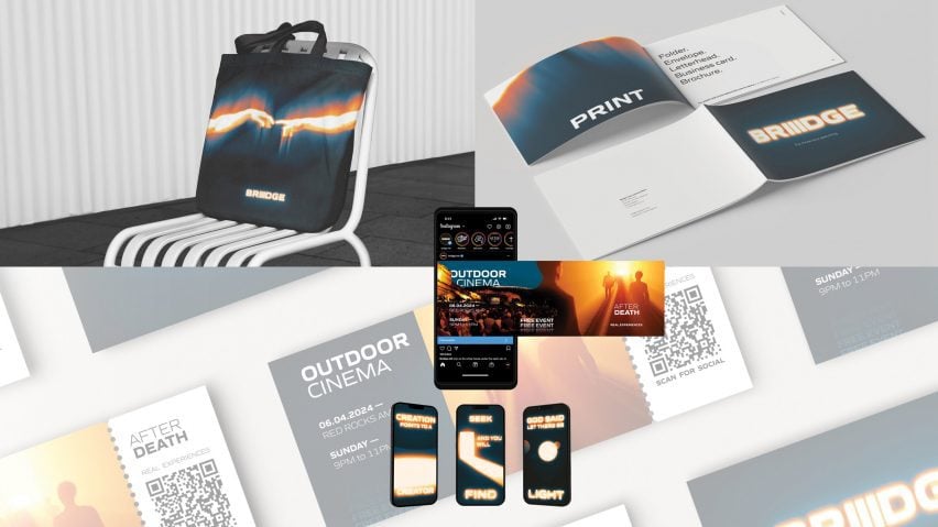
Briiidge by Christina Zerby
“The concept of Briiidge stems from a conversation around whether religion is still relevant in our modern world.
“Research shows that 85 per cent of the world’s people still identify with a religion of some kind, setting the stage for a nonprofit like Briiidge to offer guidance and community.
“Design elements that outline Briiidge conceptually capture founding pillars in Christianity, including the idea of the holy trinity, which is represented by the three letter ‘I’s in the logo.
“By using design principles of abstract imagery and bright colours, Zerby managed to design an informative identity that goes beyond traditional religious representation.
“The marketing strategy for Briiidge incorporates merchandise, events, brochures and online content.
Through these mediums Briiidge intends to usher in a new forum for religious discourse and community building.
Student: Christina Zerby
Course: Design Research Project
Tutor: Eleanor Ferguson
Email: christyzerby.fidistudent[at]gmail.com
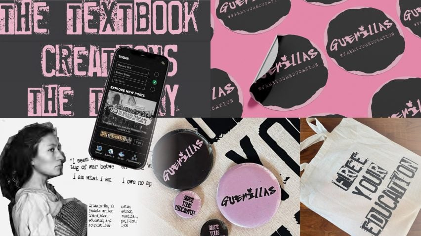
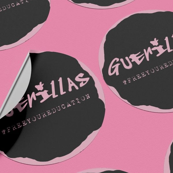
Guerillas by Sofia Faye Papadopoulous
“Redefining today’s educational material, Guerillas is an organisation dedicated to creating new media and source library for students in the US.
“Through the lens of deconstructive, punk design Guerillas hopes to refocus school materials towards a younger eye.
“Papadolpoulous consciously rejects the standards of US textbook design today by incorporating new design elements through colour and material that create emotional stimulation and a unique, sensory way of learning.
“Deconstructivism, a founding design principle behind Guerillas, invites young learners to the notion that everything should be questioned.
“Intending to be widely accessible, Guerillas materials include both physical and online elements such as textbooks, an app and an augmented reality series.”
Student: Sofia Faye Papadopoulous
Course: Design Research Project
Tutor: Eleanor Ferguson
Email: ssofiapap[at]gmail.com
Partnership content
This school show is a partnership between Dezeen and Florence Institute of Design International. Find out more about Dezeen partnership content here.

