Discussions on creative thinking and productivity often center on best practices, streamlining processes, and a smattering of other solutions that make the workforce responsible for inspiring themselves. But the onus to stir the human spirit should be shared by the architects and designers crafting these spaces. Just as actions towards sustainable outcomes positively impact well-being, so too do beautiful conditions enhance the pursuit of innovation.
Dynamic – an industry research site promoting cross pollination between the commercial and institutional, office and laboratory – has become a model for interiors informed by this philosophy. Designer Melanie Raines, of her eponymous studio, tempers this high-traffic facility with high-touch finishes that rival those typically found in luxury residential projects.

Dynamic is a 355,000-square-foot building – atop Houston’s 37-acre life science campus called TMC Helix Park – comprising 12 stories of research-based environments created in partnership with Beacon Capital, the developer who selected the Austin-based practice for Raines’ innate ability to speak an enchanting architectural vernacular free from superfluous honky-tonk. Scientific investigation requires an atypical, intense level of interest and rigor not for the faint of heart. The designer dignifies this workplace with venerable interiors and layers of material treatment that are as unexpected as they are inviting.
“We drew inspiration from a well of aspirational hospitality projects, local makers and materials, and conversations with future tenants,” Raines says. “With so much sameness online these days, a designer is only as good as their sourcebook. We’re constantly engaging with makers and investing in building relationships as an essential part of this work,” she adds. “It is personally satisfying to see teams from other buildings in the park, award-winning in their own designs, come by and remark at how different Dynamic feels.”
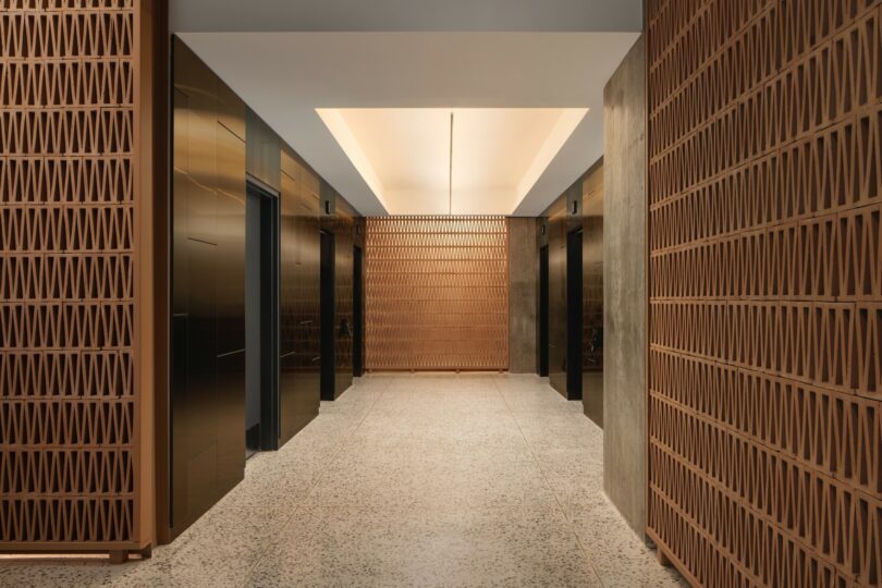
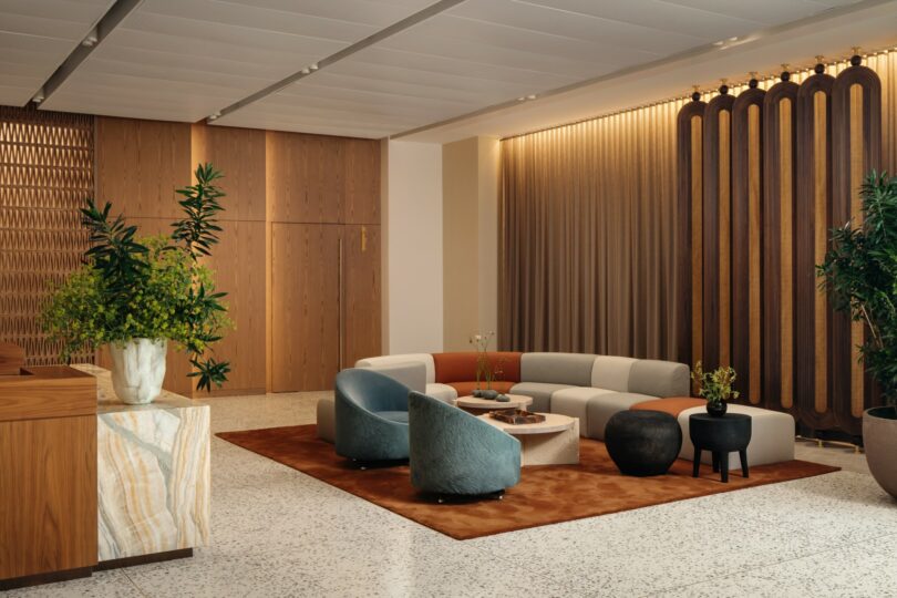
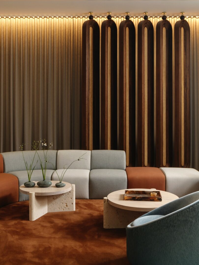
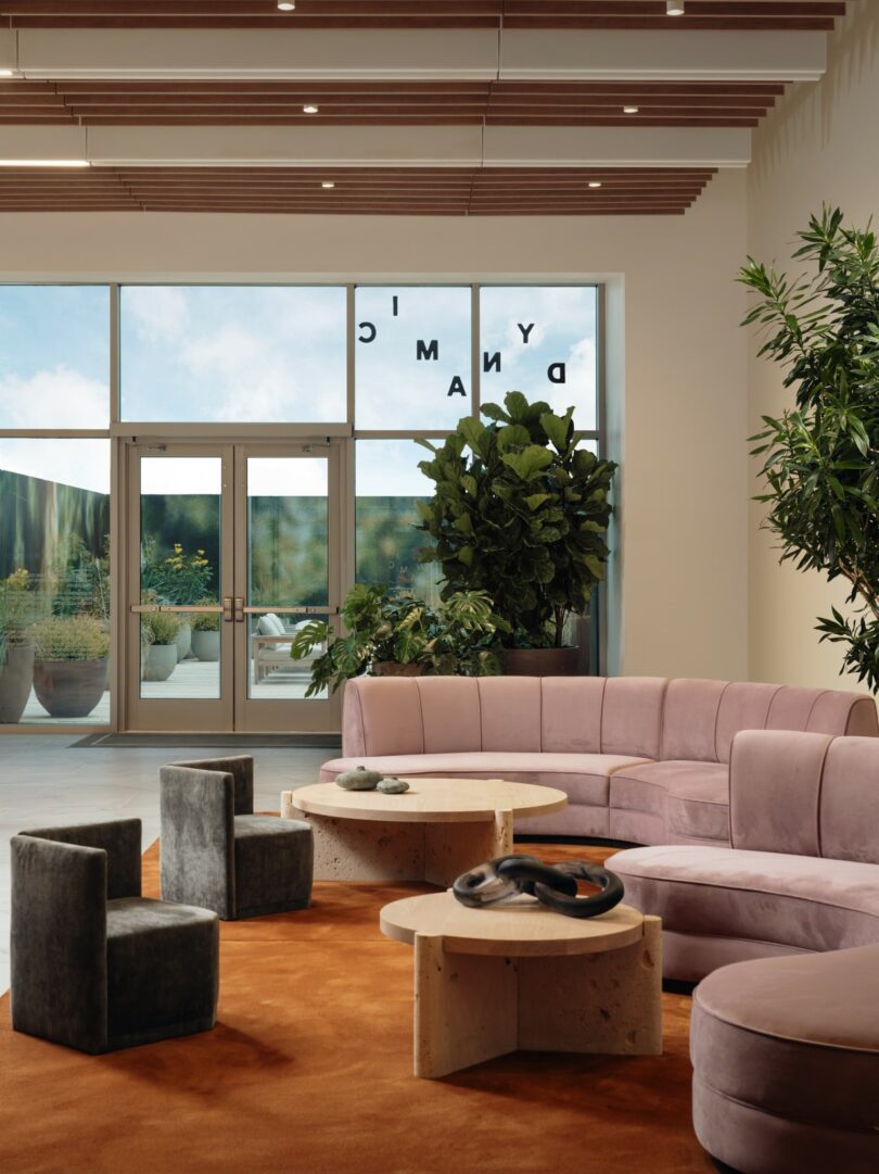
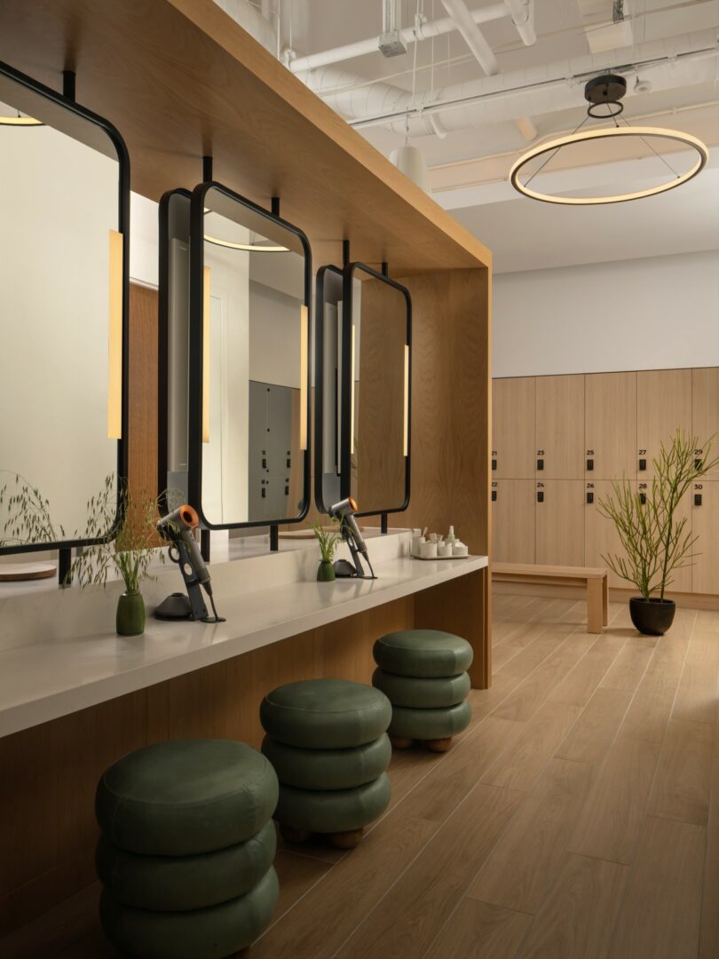
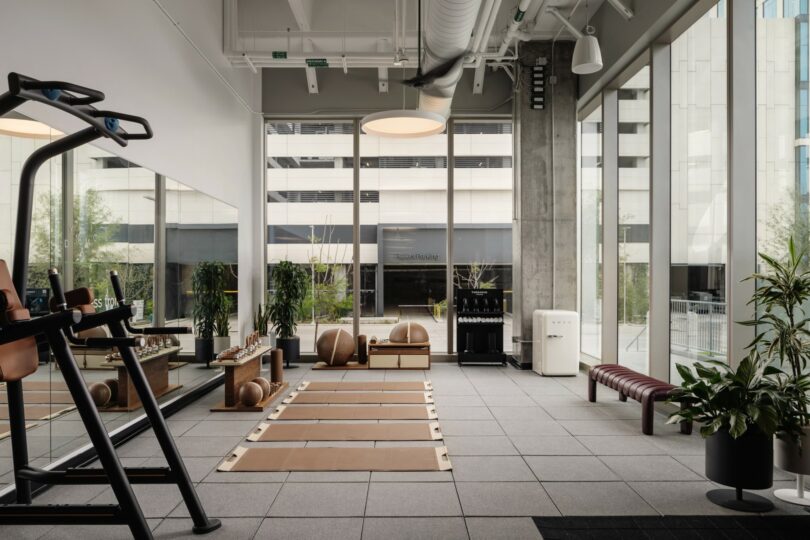
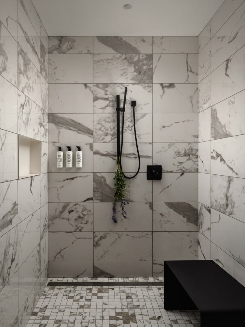
Raines’ ethos is first anchored in the 4,500-square-foot lobby experience, which delights in the potential for discovery that may lie ahead. It is an extreme departure from the daunting interiors typical of corporate American architecture. Tenants and visitors enter through a plaza that pulls the park inside to a public lobby. It offers a lounge space as well as reception, where guests may either pass through to the gym and lockers, or a set of elevators that lead to the floors above. The entry boasts an artful Texan palette with a main desk made of rainbow onyx and American black walnut alongside a backdrop of custom breezeblock, poured terrazzo and marble flooring, and bronze metal panels.
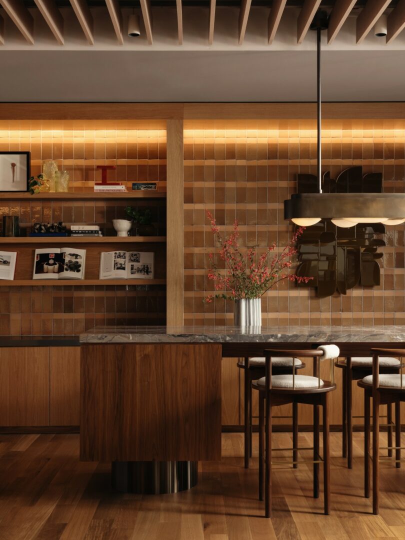
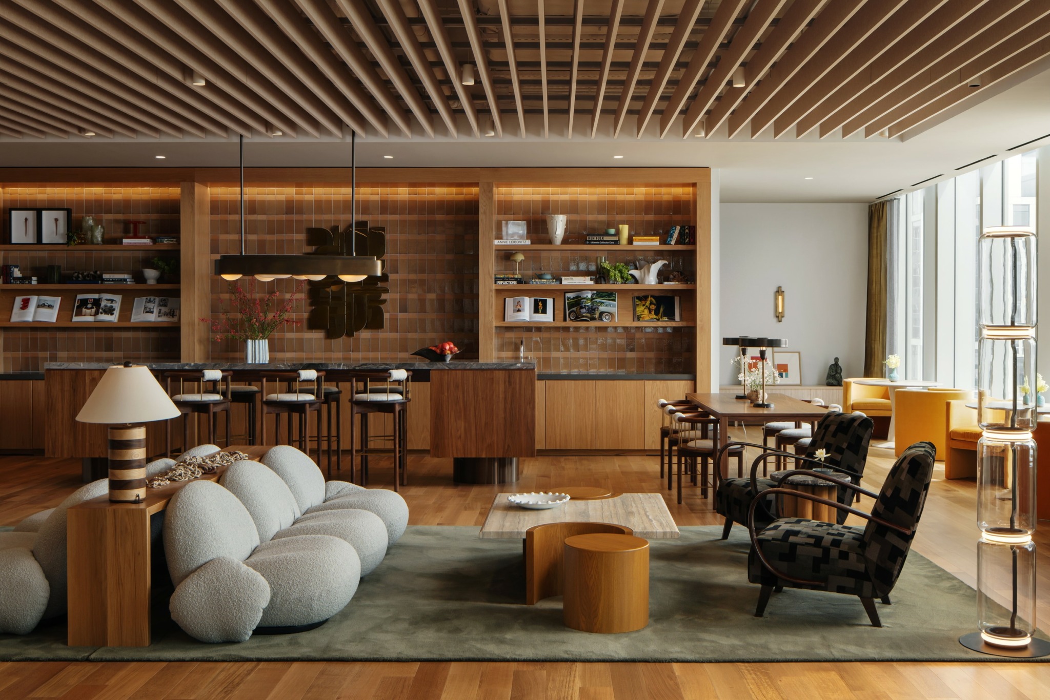
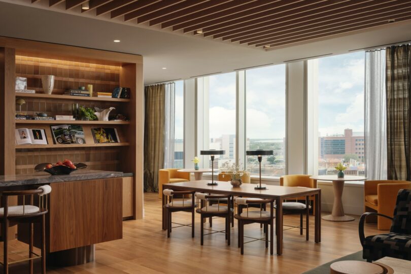
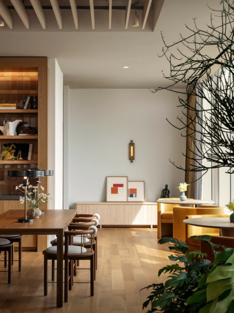
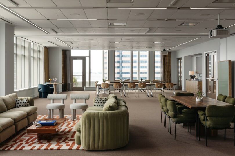
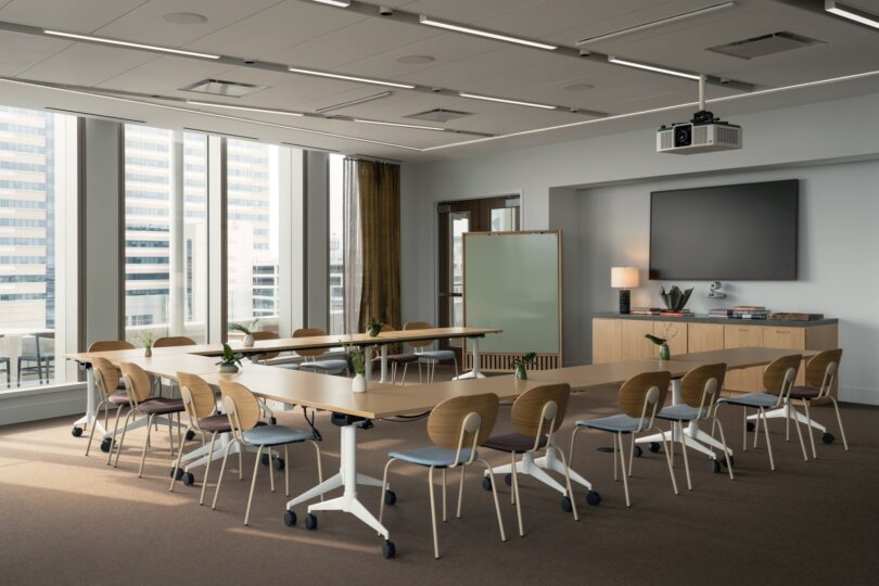
In contrast to the clinical spaces surrounding it, the 7,000-square-foot amenities floor celebrates employee dedication as it echoes previous sentiments of hospitality through softer, sensory environments. Another lounge greets guests off the elevator, melding with a continuous string of training rooms and balcony that showcases panoramic vistas around the periphery. White oak casework incorporates handmade tiles into what is Dynamic’s second distinctive piece of millwork. This library shelving, in combination with unique seating arrangements, serves to be a resource as well as a place of respite. Additional magazine racks display periodicals to encourage collaboration and discovery outside of the typical workspaces.
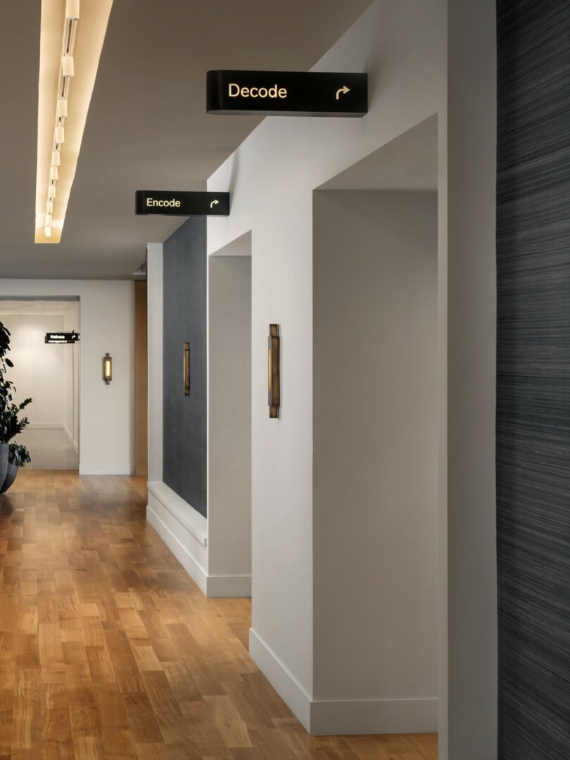
What’s more, most furniture pieces throughout are custom creations for the project if not procured from vintage sources, marrying aesthetics with utility. And the variety of lamps, sconces, and chandeliers add sculptural elements to each space while mitigating scale to foster a sense of intimacy in otherwise expansive spaces. Fixtures, furnishings, and flooring alike are specified for their ability to withstand heavy traffic while being light enough to rearrange into fresh, atmospheric vignettes and easy to maintain.
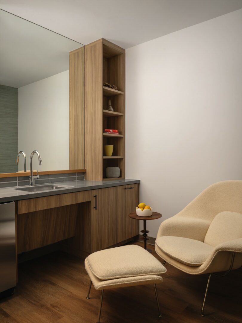
Raines manages an effortless fusion of the pragmatic, pretty, and personal. “Unlike a boutique hotel which can be highly-conceptual and typically only a pass-through, this building is a second home for many, so it needed to be warm and artful without being overly-designed.”
To see this and other projects by the designer, visit melanieraines.com.
Photography by Chase Daniel, courtesy of Beacon Capital Partners.

