We continue our series on mid-century modern design with a profile of Ray and Charles Eames, the duo that championed a functional and democratic approach to design.
Their iterative, materials-focused approach saw the designers harness mass-production techniques in an attempt to create what would be enshrined in their motto as “the best for the most for the least” – including the world’s first moulded plastic chair, the Shell chair.
The Eameses were not interested in innovation for innovation’s sake, but as a means of problem-solving, and making the solutions available to all.
As Ray Eames herself would put it, “what works is better than what looks good. The looks good can change, but what works, works.”
This perhaps explains how their studio Eames Office achieved a remarkable impact with a comparatively modest output. As architect Peter Smithson would remark to the magazine Architectural Design in 1966, it was with “just a few chairs and a house” that Charles and Ray Eames were able to profoundly impact the landscape of design.
Charles Eames and Bernice Alexandra “Ray” Kaiser met at the Cranbrook Academy of Art in Michigan in 1940.
Charles was already an architect who had joined an industrial design fellowship recommended by architect Eliel Saarinen, and Ray was an abstract painter who joined the academy looking to expand her artistic practice.
The two married in 1941 and relocated to Los Angeles to establish their studio Eames Office, initially working out of their apartment in the Westwood neighbourhood.
Early work explored moulded-plywood designs
The early work of the Eameses focused on experimenting with moulded plywood. This had been initiated by a chair they had designed with Finnish architect Eero Saarinen while at Cranbrook, which won first prize in the 1940 Organic Design in Home Furnishings competition at the Museum of Modern Art (MoMA) in New York.
Plywood bent along a single curve had long had applications in furniture, but the Eameses were drawn to the possibility of moulding it across three dimensions in order to better contour to the shapes of the human body.
The Eameses wrote in 1953 how “the problem of designing anything is in a sense the problem of designing a tool,” and for their furniture, their tools were the patented “Eames process” and a homemade device they called the Kazaam! Machine.
Named after the fact that it worked “like magic”, the Kazaam! Machine worked by bonding multiple sheets of thin veneer with thermosetting resin around a mould, originally inflatable balloons.
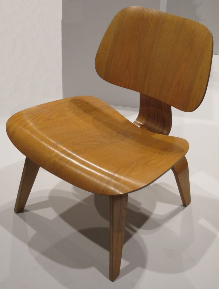
While their competition design in 1940 had not been deemed mass produceable, by 1945, the Eameses had developed a range of furniture known as the Plywood Group, most significantly the Lounge Chair Wood or LCW.
This low chair featured an angled, curved seat and a small curved back connected with rubber shock mounts, designed to be comfortable even without the addition of upholstery.
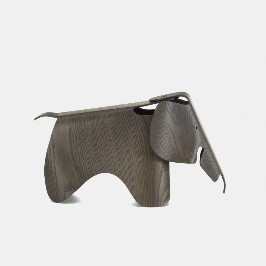
Along the way, these experiments led to what would become other products – the Eames Elephant, for example, was designed in 1945 as part of a group of animal stools for children, and has today been reproduced in plastic.
These same plywood-moulding techniques were also used, as Ray put it, “to aid in the war efforts without hurting anyone”, creating wooden splints and prototyping a stretcher for use by the military.
Despite the successes of the Plywood Group, the need for low-cost furniture that could be mass-produced after the end of the second world war meant there was still a problem for the Eameses to solve.
In 1948, they proposed a fully moulded shell chair in their entry into the International Competition for Low-Cost Furniture Design, also sponsored by MoMA.
This was intended to push the organic forms of the Plywood Group even further, creating a singular, curving shape that comprised the seat, back and – for certain models – arms, and could be mass-produced to a consistently high quality and fitted to a variety of different bases.
Fibreglass used for both furniture and architecture
True to form, the Eameses did not want to develop a new material but rather apply an existing one, and the second world war had led to the development glass-fibre reinforced polyester resin, originally used for aircraft radomes and cockpit covers.
The Eameses entry suggested the use of stamped steel, but subsequent iterations saw them arrive at the material of fibreglass via a boat manufacturer, leading to the Fibreglass Chair, the world’s first mass-produced plastic chair.
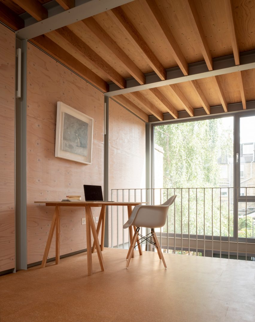
Available both with and without arms, the Fibreglass Chair was lightweight, robust and easy to clean. Colour was a particularly important factor, and initially three were three neutral tones available: greige, elephant hide grey and parchment, soon to be joined by a wide variety of colours.
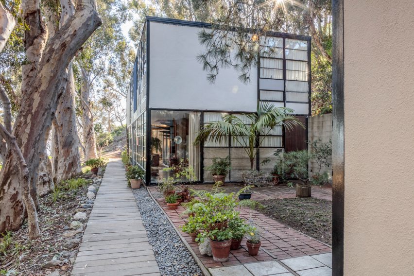
The Eameses had in fact first used this fibreglass resin in their architectural work, sourcing it from army surplus stores to create screens for their own home, Case Study House 8, also known as the Eames House, in the Pacific Palisades neighbourhood of Los Angeles.
The home was commissioned by John Entenza, the owner and editor of Art & Architecture magazine, who in the 1940s initiated the Case Study House programme.
This programme tasked the major architects of the day with creating efficient and cheap prototypes for housing that could meet the housing boom following the end of the second world war – a brief very much in line with the ethos of the Eameses.
Charles had again collaborated with Eero Saarinen on the early design for Case Study House 8 in 1945, which used off-the-shelf materials and components ordered from catalogues.
Steel shortages, however, meant that the materials were not available for several years, by which time Charles and Ray had re-designed the home to sit more harmoniously on its meadow site.
“The house would make no demands for itself and would serve as a background for life in work, with nature as a shock absorber,” described the Eamses.
The finished home was a simple steel-framed rectilinear box, with a Mondrian-like gridded facade of opaque white and coloured panels and large windows.
Inside, the double-height living area was filled with furniture prototypes by the Eameses themselves as well as works by the designers they admired and folk art they had collected on their travels.
For Entenza himself, the Eameses and Saarinen would design Case Study House 9, also known as the Entenza House, in a similar style.
Eames’ Case Study Houses were a precursor to high-tech architecture
While few of the Eameses architectural designs made it past the drawing board, their use of standardised materials in the Case Study Houses proved hugely influential, and a precursor to the high-tech style of architecture that would become popular in the UK a decade later.
The Eameses were also interested in photography and film as a means of communicating their work, and the studio would create nearly 200 films.
Some demonstrated their products, such as Fibreglass Chairs – Something of How They Get the Way They Are, and others were more educational, such as Powers of Ten, a short film depicting the scale of the universe in factors of ten – from outer space to a molecule in a man’s hand.
After Charles’ death in 1978, Ray would continue to run the office and lay the foundations for their legacy until her own death 10 years later (to the day) in 1988.
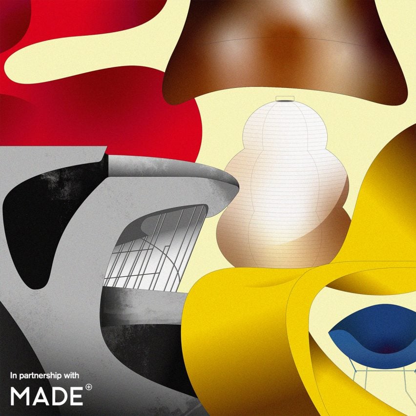
Main illustration by Vesa S.
Mid-century modern
This article is part of Dezeen’s mid-century modern design series, which looks at the enduring presence of mid-century modern design, profiles its most iconic architects and designers, and explores how the style is developing in the 21st century.
This series was created in partnership with Made – a UK furniture retailer that aims to bring aspirational design at affordable prices, with a goal to make every home as original as the people inside it. Elevate the everyday with collections that are made to last, available to shop now at made.com.

