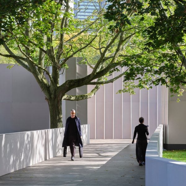
The Frieze art fair in London has unveiled its biggest redesign in over a decade featuring a layout inspired by city planning by design office A Studio Between.
A Studio Between founder Richard J McConkey looked to the theories of late urban theorist Jane Jacobs when planning the pop-up venue for the 21st edition of the Frieze London fair.
Instead of situating all the major galleries at the front, which is the typical approach of art fairs, McConkey has dotted them around different parts of the floor plan.
They are connected by “arterial roads”, as referenced in Jacobs’ seminal book, The Death and Life of Great American Cities, encouraging visitors to move around the whole fair.
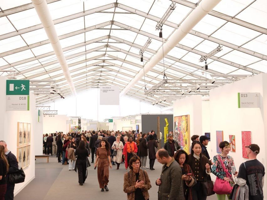
“Jane Jacobs had this idea of adding ‘chess pieces’ as attractors across the plan, which is essentially what we did with this floor plan,” McConkey told Dezeen.
The aim, which was part of the brief from Frieze, was to give greater visibility to young galleries and curated shows.
“It was like picking up Mayfair and putting it next to Shoreditch,” said McConkey. “We changed the whole geography.”
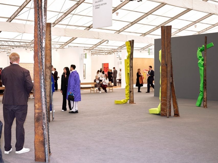
“We wanted to create an idea of exchange, with various galleries in conversation with social spaces,” he added.
“The floor plan breaks, so you have compact aisles, then moments of big release where you have lots of light.”
An estimated 60,000 people will visit this year’s Frieze London, which hosts over 160 galleries. The fair is open from 9 to 13 October in Regent’s Park.
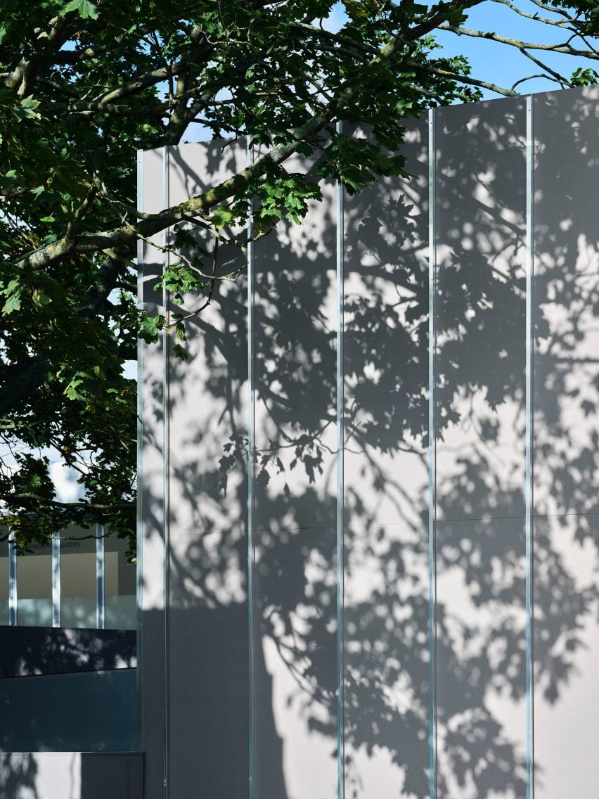
From the exterior, the new building is designed to look like a series of pavilions. The arrival point is marked by large-scale signage, displaying artwork by multimedia artist Lawrence Lek.
Behind it, a tree-lined avenue doubles as an event space, leading towards a generous staircase entrance.
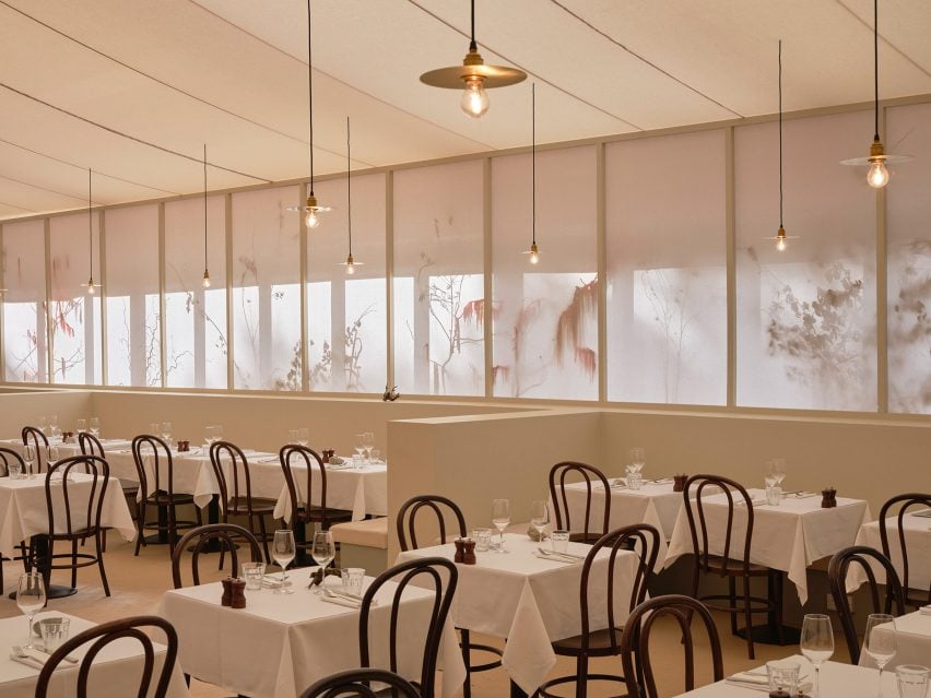
Inside, the social spaces include a dining area hosted by London restaurant Sessions Arts Club.
The walls of this restaurant are formed of cotton artist’s canvases, positioned in front of planting installations by floral artist Hattie Fox. This creates a silhouette effect, while also filtering light and dampening acoustics.
“The brief was based on three key ideas: secrecy, the cinematic and studio,” said McConkey.
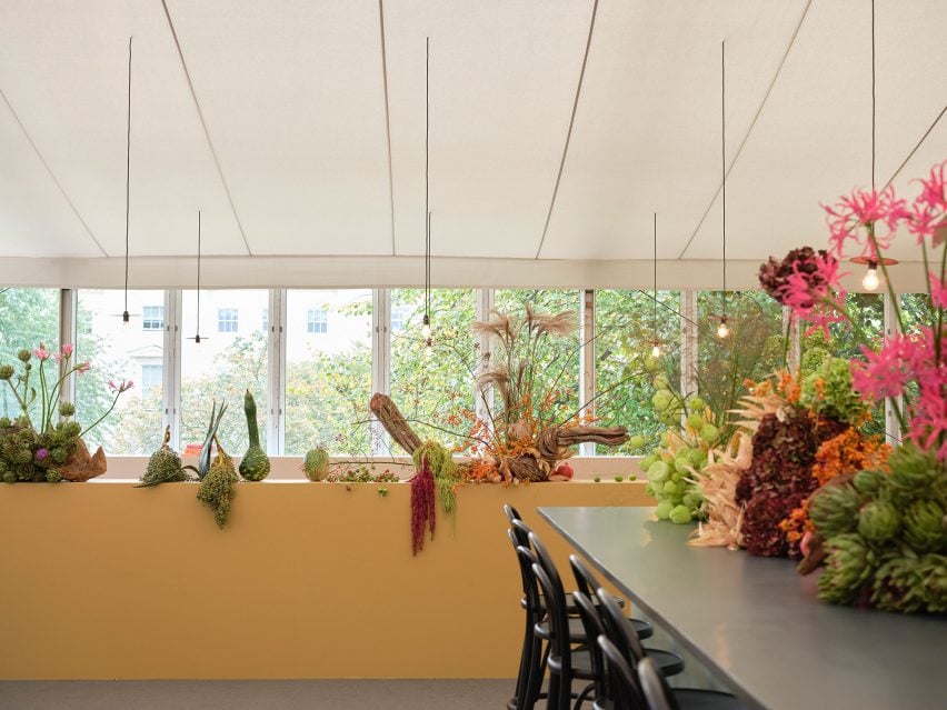
Fox’s installations also feature in the Jikoni restaurant, where the colour palette includes vibrant shades of pink and yellow.
Danish brand Fredericia provided furniture, with existing products adapted to suit Frieze’s specific requirements.
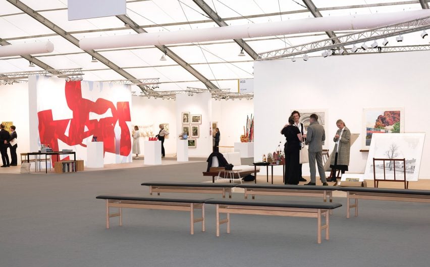
A Studio Between worked with the estate of designer Børge Mogensen to develop a low backless version of the mid-century 3171 bench, which features alongside the classic backed version.
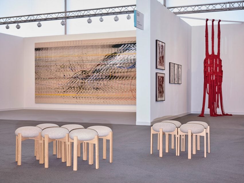
The studio also designed a 3D-printed connector that allows the Maria Bruun-designed Pioneer Stool to be placed in social clusters.
“We could have just designed a bench, but it was more interesting to do an adaption,” said McConkey. “I’m a huge believer in collaboration.”
McConkey first started working with Frieze a decade ago. As the former head of hospitality for Universal Design Studio, he was involved in the last major overhaul of the London venue, in 2014.
That design was ahead of its time in terms of sustainability and reuse ambitions, but the latest version goes even further.
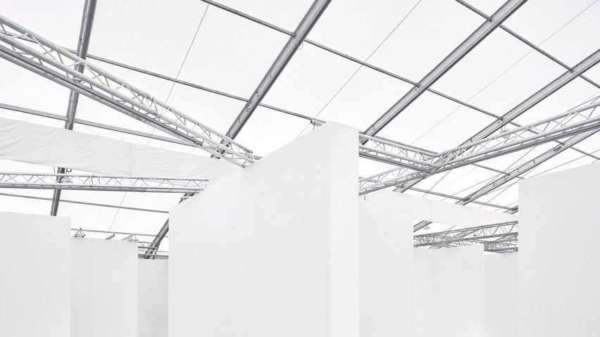
The structure consists of a modular, lightweight cassette system that can be easily disassembled and reused for future editions, as well as for other events. Its flexibility means it can facilitate various configurations.
“It’s essentially a kit of parts,” said McConkey. “The galleries get a shopping list to choose from and everything is built on this idea of continuous reuse.”
Overhead, lighting is provided by low-energy LEDs with a high colour rendering index (CRI). Combined with the translucent fabric roof skins, they light the space rather than the artworks.
The photography is by Leon Chew.

