More than 20 local designers worked to revamp sections of a sprawling modernist mansion in Mexico City around the theme of future houses during this year’s Design Week Mexico.
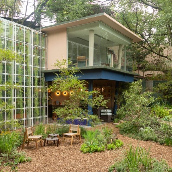
This year’s iteration of the annual Design House took place in a residence in the city’s Lomas de Chapultepec neighbourhood, with a primary 1960s modernist structure and, lower on the property, an annexe with a massive glass atrium designed in the 2000s by architect Juan Garduño.
Over 20 Mexican designers were given just a few weeks to completely transform assigned sections in one of the structures, with some building new interior architectural elements into the design such as walls – and even ceilings.
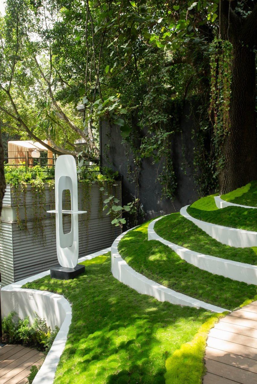
Compared to past years, one of the most significant elements of the project was the implementation of landscape design, with multiple studios such as Jardin Sustentable, Cica Paisaje, and Paisajismo YAAX creating elegant natural spaces imbued with native plants, walkways, furniture and sculpture in different areas of the park.
At the uppermost terrace, Studio Roca created a massive wood portal that users people into the series of paths that weaves through the grounds.
“I’m very proud of the landscape teams,” Design Week Mexico (DWM) co-founder Emilio Cabrero told Dezeen.
“To create this wild prairie, they started from seeds and only had six weeks. They did a fantastic job because all of this area was completely abandoned.”
Adjacent to the Studio Roca portal was the exhibition entrance to the four-storey primary house. Visitors were ushered through an open wall to a gallery showcasing the evolution of DWM and Design House over the last 15 years.
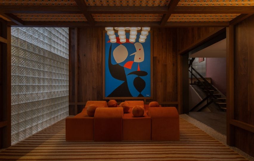
On the next floor, architecture studio Espacio Tangible and textile design outfit Balmaceda laid a sculptural red daybed in front of a wall of glass brick and painted a geometric pattern on the wood-lined ceiling.
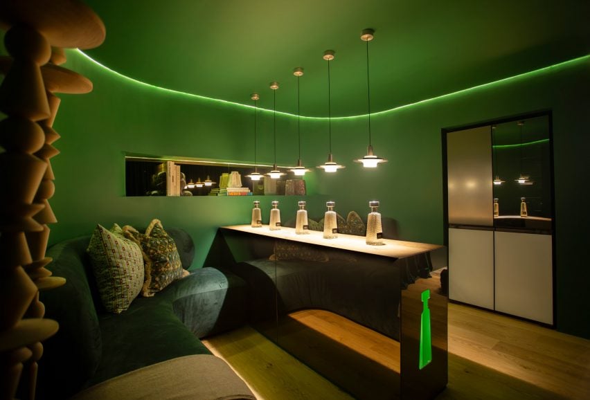
Also on this floor was a space by local design studio Ad Hoc with liquor brand 1800 Tequila, rendered almost completely in green with a long wood-and-metal bar running down the middle topped by stainless steel lights by Studio David Pompa.
The green was chosen to reference a future where plant life has overtaken the built environment, according to Ad Hoc co-founder Juan José Nemer.
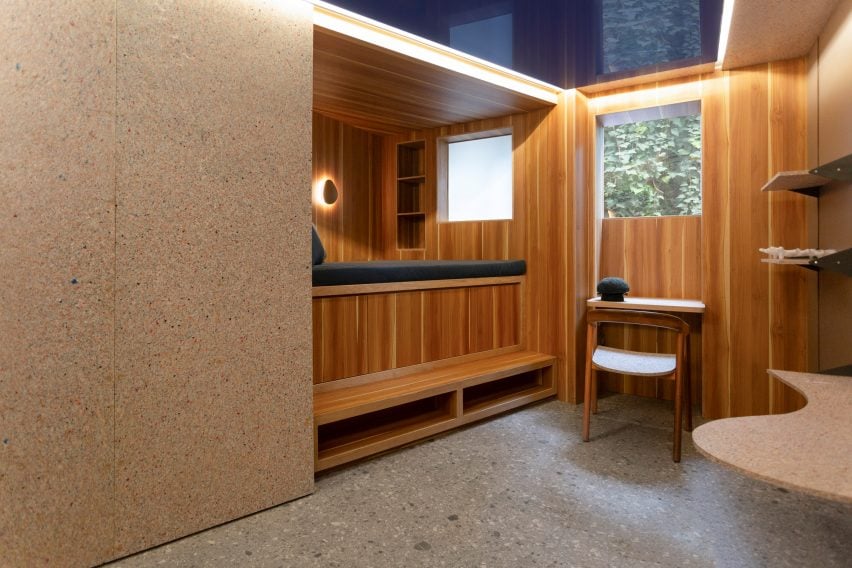
Through Ad Hoc’s space was a small room conceptualised by furniture design studio Irrelevante and designer Rosela Barraza.
For Barraza, the small space was an opportunity to conceptualise a future dwelling where space and materials have become more limited. She used the recycled plastic materials and furniture from Irrevelante to create a wall unit that slides to reveal utilities on one side and a lofted bed on the other.
“[The future] is solving a problem,” Barraza told Dezeen.
“It’s not just making beautiful things, it’s thinking about the longevity of things. It’s about materials.”
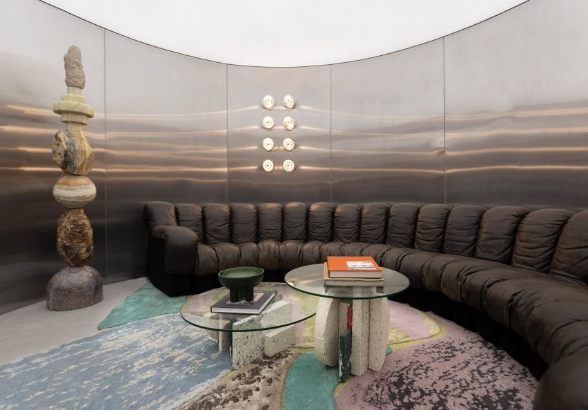
Upstairs, a room by Studio 91 took a “retro-futurist” approach, showcasing a room with metallic walls and stone elements that led to a circular listening room with a leather wraparound De Sed sofa flanked by stacked-stone obelisks by Sten Studio.
Studio 91 founder Jaime Bucay said that his approach involved taking things from the past to “advance the future”
“Humans don’t like robotic things because they are scared of the future,” he told Dezeen. “So sometimes you need to go back to the past and feel the nostalgia for the moment.”
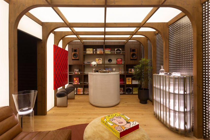
On the uppermost floor, Mood Estudio and Casa Palacio took a similar approach, with a 1970s-informed lounge area complete with turn tables and back-lit ceilings crested with finned wooden supports.
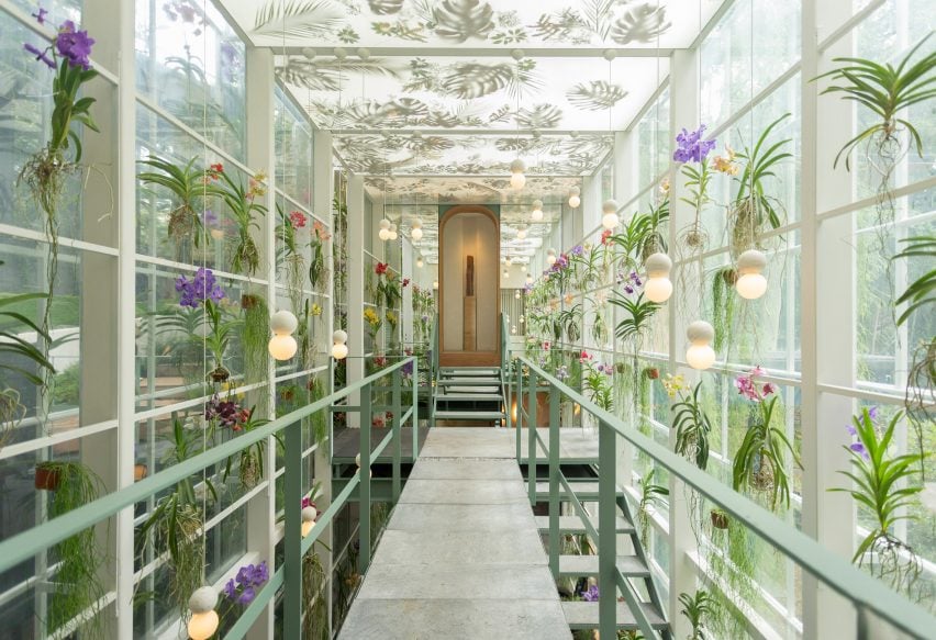
Back out through the yard adjacent to the big house and down a series of steps, the smaller annexe building has an entrance in the middle of a stunning two-storey glass atrium covered in plants by Huatan Paisajismo and lights by Studio David Pompa.
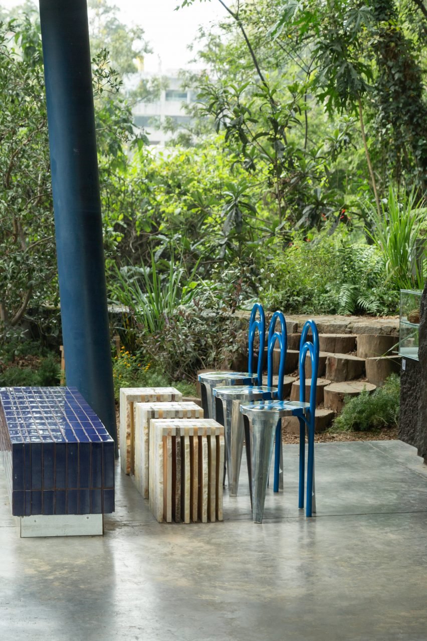
Down a set of stairs was a double-height space designed by Raúl De La Cerda and in the backyard was a cafe by Rodrigo Noriega Studio and Quinto Piso, featuring cobalt and silver chairs designed by the team custom for Design House.
Other showcases during this year’s Design Week Mexico included an exhibition where French furniture studio Hall Haus created a “mix tape” of its designs with local fabricators and designers.
Earlier this year Gallery NC Diseño in Bogotá launched a similar exhibition, with 10 Colombian designers outfitting a mansion in the city.
The photography is by Alum Galvez.
Design House was on show from 10 October to 3 November in Mexico City as part of Design Week Mexico. For more exhibitions, talks and fairs in architecture and design visit Dezeen Events Guide.

